Visual Studio 2013 Ultimate Preview Released
Barely a month has gone by since the announcement at Tech Ed North America 2013 yet Visual Studio 2013 Preview is available to download. TFS 2013 Preview is also available, however as I use the Team Foundation Services hosted by Microsoft, I’m just going to focus on VS 2013. .NET 4.5.1 preview is also available, which is installed when you install the VS 2013 preview. .NET 4.5.1 is also included in all installations of the Windows 8.1 preview. These products are classified as “go-live” by Microsoft, so they will support them in production.
The download is available here so let’s have a quick walk through of downloading and installing and first impressions. The Visual Studio 2013 expire date is the 15th January 2014 (by my calculations: I installed on the 27th of June 2013 and had a 202 day licence.) There’s quite a few images below and you can click on them to see them at 100%. I’m going to delve further into each feature at a later date. First, a note of warning: when I open up Visual Studio it’s do to some database or MSBuild related work, so I’m not going to go into features that aren’t really for me. If you want to know more about the dev features then I recommend you read Somasegar’s blog, which does the new dev features far greater justice then I could.
On my home machine, the total install required ~9GB and even if you change the install path to another drive it still required ~3GB on your C drive. The install took about 15 minutes. That was faster than VS 2012. No reboot was required.
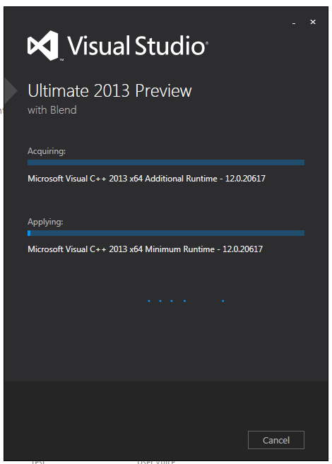

Bizarrely, on my work machine, the disk requirement was 12GB. Weird. The time of the install took quite a bit longer on my work machine. The specs of my home machine and work machine are very similar (both built in the last 15 months), with my home machine edging it just it terms of processor and RAM. I did have to reboot my work machine.
And the splash screen is very similar to the previous version. You can also choose you default dev settings (whether you use C# or SQL primarily etc). You can also choose the default colour scheme: light, dark or blue. The blue theme was part of one of the updates, and now it is part of the product. It makes VS look like it did in it’s 2010 incarnation.

Once you have opened VS 2013 you can choose to log in with a Microsoft account, or not. It’s entirely up to you.

The idea of logging in is that most people use more than one machine, and like to spend quite a bit of time customizing the IDE. So this can become challenging if you have more than one device. When you log in, your personalized options (eg line numbers being on, I could never understand why you wouldn’t want this) will be applied to the IDE. If you want to see what settings you can synchronize then if you go to Options > Environment > Synchronized Settings you can see the choices available to you on a per machine basis.
I’ve closed and opened VS 2013 a few times since the initial startup and found the start up time of VS 2013 far quicker than VS 2012, and I wasn’t waiting an age for objects to load etc.
So from a visual perspective, what has changed? Well there’s a little more colour to the Team Explorer which is very welcome. Sometimes with VS 2012 I feel like that there’s a white button with off white text that changes white when you’ve hovered over it and back to off white when you’ve clicked it! So icons have been improved and the lines that define the edges have been improved. Contrasts have also been increased for different areas/scroll bars.
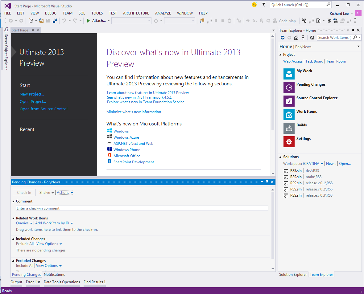
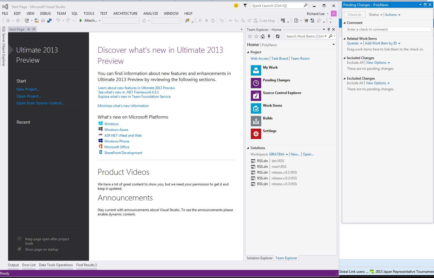
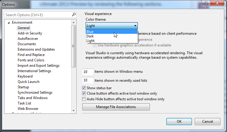
As I said I’m quite a fan of the light theme, but if you do ever change your mind then you can go to Options and change the theme.
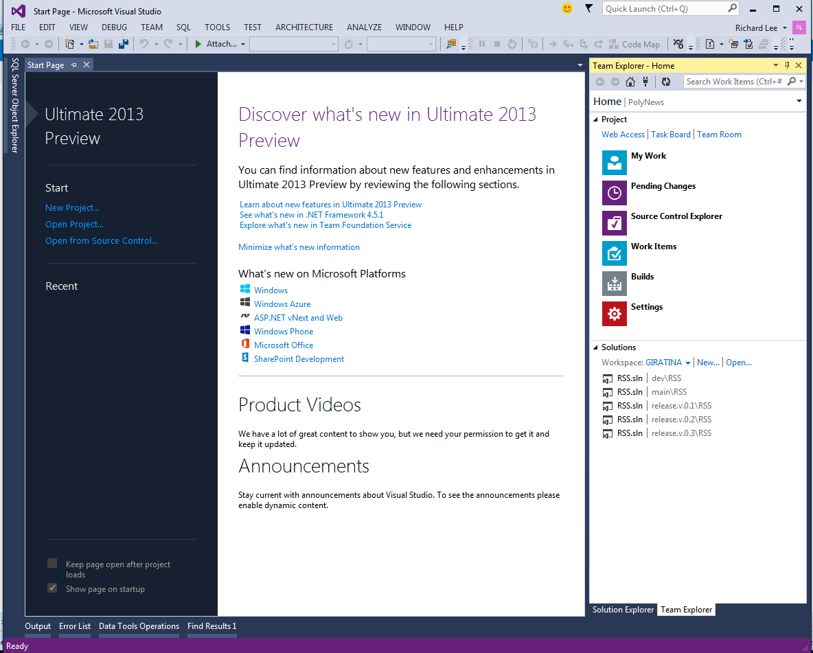
Microsoft have also been pushing the Web Access aspect of Visual Studio hard. In the Home pane they have added a link direct to the Web Access section. They’ve also included a link directly to the Task Board and also the Team Room. Whether people really adopt concepts like Team Rooms will remain to be seen, I guess it really depends on the geographical proximity of team members, how frequent the teams change, and what other technologies people use to keep in touch?
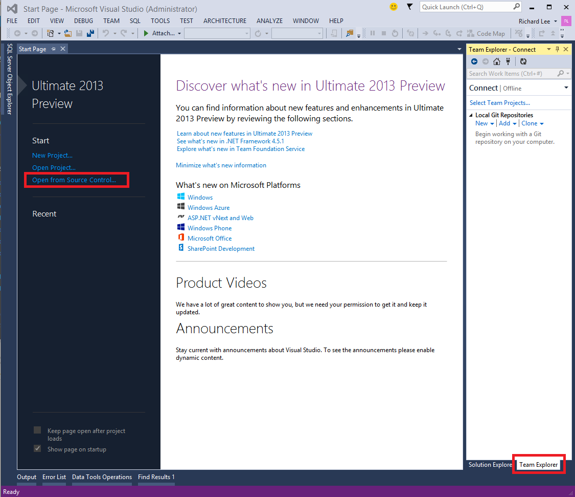
There is also a link on the Start page to allow you to open from source control which will open up the Team Explorer hub. I spent way too long trying to figure out how to open the Team Explorer hub initially, so I’ll remember this.
The balloon update has also been refined to a notification flag. You can pick and choose which items you want to install, and you can dismiss ones that do not pertain to your environment. Notifications will expire after 30 days and will only appear again if there has been another update that you might want to install. It’s good that we won’t be hassled into applying updates constantly for things that we just don’t care about.


This notification window also hides when you’re no longer hovering over it, so it won’t block your work.
In the light theme, the hover colour has changed to blue in VS 2013 (top) from grey in VS 2012 (below).

You can see that it really blended in with the background on the older one. You can also see the improvements to the contrasting between the IDE’s in the picture above.
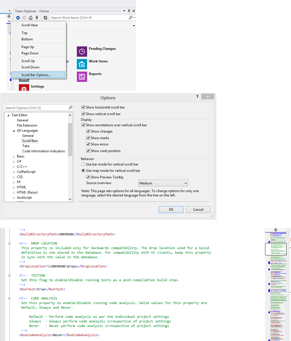
In addition to these changes, the Map Mode scroll bar in Visual Studio allows us to see where we are in the context of the whole file. Particularly useful when you have a large build file… If you click on the scroll bar and select “Scroll Bar Options” you can choose Map Mode and configure to your liking.
This is just a few of the features that have been addressed in Visual Studio 2013. Seeing as this is a preview (a preview that will run for over 200 days(very generous)) you can also give your feedback in the form of a smiley or a frown.


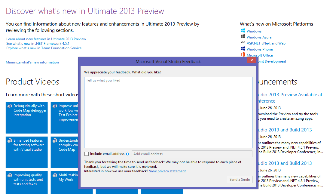
there is also an opportunity to add what it was you did like or didn’t like. Seeing as this preview is going to last for 200+ days, I have a feeling that the release for VS 2013 and TFS 2013 will be right at the end of the year. The team are working in a Scrum methodology, and with Update 3 out of the way I reckon all their attention will be focused on fine-tuning Visual Studio 2013.
The Launch Performance Wizard also keeps crashing on me when I open it. I’ve sent a frown to Microsoft about that one as I was able to repro 3 times.
Also the web test recorder window is not appearing in Internet Explorer, meaning I am unable to record tests. This is an old feature so I assume I am doing something stupid here, but I’ve not been able to figure out what, so I’m going to file it under an issue.
